Exhibit Mobile App
UXR, UI, brand design for Exhibit
After I moved to the Brady Arts District in Tulsa, OK in 2021, I was pleasantly surprised by the large number of galleries and fine art event spaces. Attendance at these places seemed to grow by the month. However, in some of the most popular galleries, I often noticed the attending employee or curator and once, an owner, passing around a sign-in book. You know, the kind with a pen secured by a string? The whole thing felt like obvious analog-to-digital potential.
View Hi-Fi Prototype
Project details
So, what if there was a gallery app that could house information and marketing for all local exhibit information, ensure that gallery owners keep track of patron/donor information and allow attendees to check-in upon arrival—incentivized to do so by a point or discount system of some kind? An app must already exist? Spoiler alert: It kinda didn’t.
Features Brainstorm
I started by doing some simple secondary research and a competitive analysis for local, national and international gallery and museum apps.
Competitors
A DEEPER Understanding the Problem and The goal
Via competitive audit, we learned that no other competitors offer the same features in parallel apps. While this may have signaled a gap in the market ten years ago, in 2021, the obvious question is “why?” — ultimately the cost to maintain and update a mobile app may outweigh financial resources for the bulk of galleries and museums which are often free to enter and rely on grants, donations or, in many cases, fine art purchases to stay open. Also, the pandemic has also slowed in-person visits and group attendance.
With this app, the aim was to build motivation for B2C users through a digital rewards system and a better, more satisfying in-person experience, while also making art purchases, ticket sales and data capturing seamless for a wide spectrum of businesses. By yielding more donations, more sales as well as higher number of return visits, the Exhibit app can be positioned as a necessary expense for this sector to fill a clear vacancy left by the leading gallery, museum or art exhibit apps.
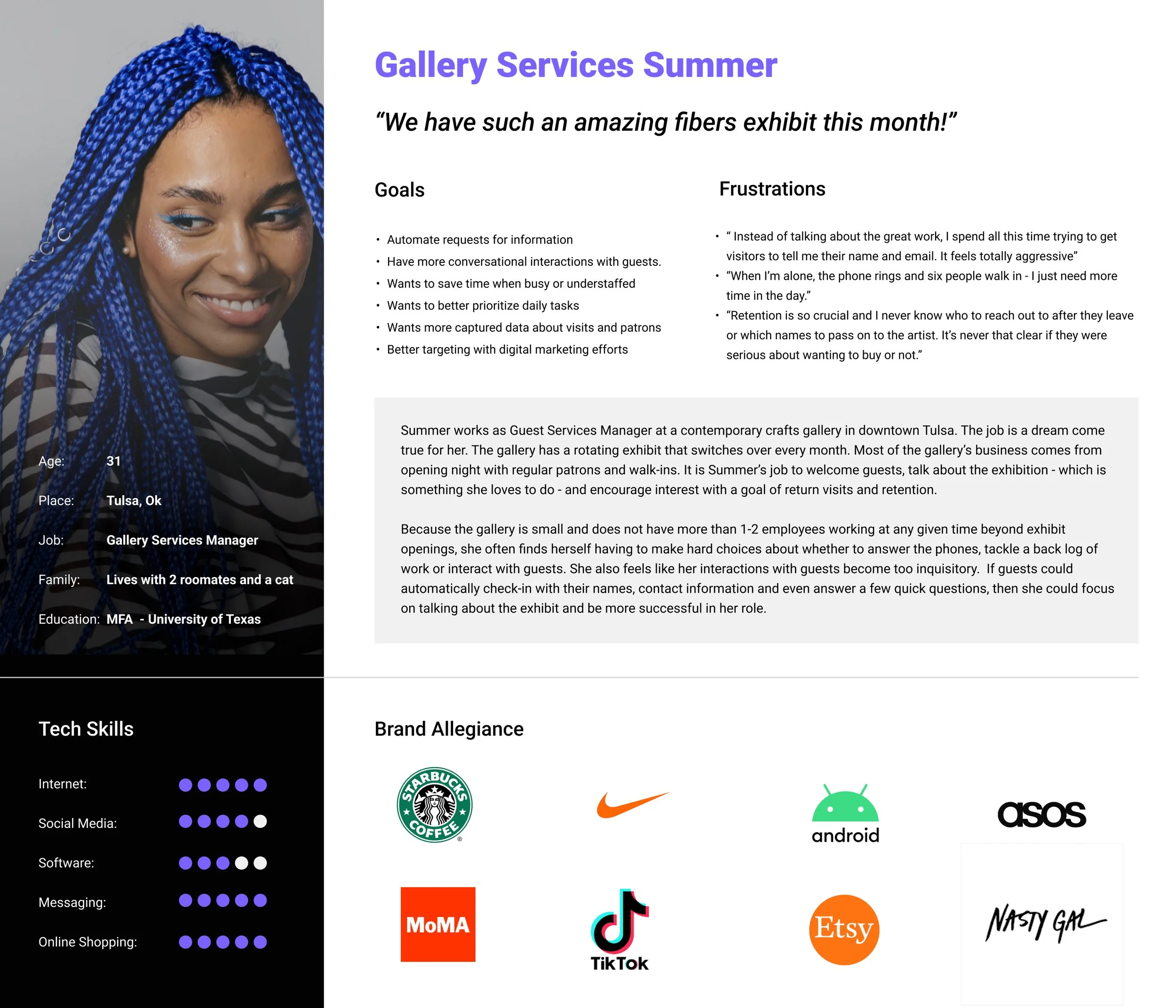
Personas
Personas were developed in two ways. The first was by speaking directly with both owners and attendees at various gallery and art events to determine needs. Everyone I spoke agreed that check-in would be helpful. Most potential users also had additional suggestions for the app and it became clear that I would need to whittle down the features wishlist into a few clear priorities so that an MVP of the mobile application could be developed for testing. Testing would, of course, turn out to be crucial.
Storyboards
Stakeholder consensus was to focus on value add flow and features for annual high profile donors. This prioritized Persona 1 as our key user pool. The storyboards below articulate
USER Flow
Original user flow describes both event check-in and ticket purchase as well as data capture and triggers for enterprise admin. Reverse geo-tagging also implied via location feature and map for check-in reminder upon date, expected arrival time and proximity to event location.
WireframeS
Paper Wireframes
Moderated Usability Study 1: EmpAThy Map
In a moderated remote usability study, 4 participants navigated the lo-fi figma prototype and answered a series of questions.


